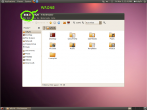
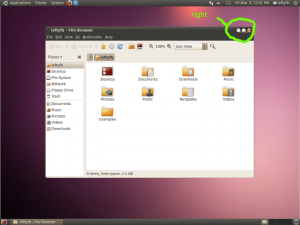
I was going to write up a post complaining about the new version of Ubuntu moving the close, maximize and minimize buttons from the right-hand corner to the left along with instructions for changing it back but Daviey has already done that for me.
I’ve said it before and i’ll say it again; They can set whatever they want as default. Just give the average end user an EASY and intuitive way to change it to their liking.
gconf-editor is not average user friendly and this type of this is most certainly something the average user is going to want to change back. No matter how much the design team wants everyone to “just get used to it”. I’m getting real tired of designers telling me how I should use my computer.
Other than this major problem, I think the new theme and colors look great. I never disliked the orange and brown theme, but a lot of people did. This should make the OS more appealing to a larger audience.

