Tag Archives: usability

The Gnome war on features continues…

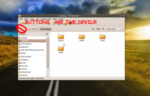
We’re back with another fun-filled episode of “How long till Gnome has a single button as it’s only feature?”. On today’s episode, Gnome has removed the ability to toggle between the text-based location bar and breadcrumbs with the touch of a button. This has always been a handy feature in nautilus for quickly navigating to hidden directories( .local ), to Windows (SMB) shares, FTP or SSH shares while toggling back the “better” looking breadcrumbs with only the click of a button. Not anymore folks! Remember, buttons are the devil!

UPDATE: The original bug in launchpad can be found here and the corresponding bugzilla bug for gnome here. And here is David Siegel’s post about the bright idea to remove yet more features including this one.

P.S. Yes, I know you can use CTRL+L or / or use the menu’s to bring up half the functionality of the button. The average user (who yes, does/did use this) shouldn’t have to learn hundreds of magic combo key’s to navigate their computer. Nor should they have to use the command line.

My first bug fix

Continuing on from my last post.

  • step #4 fix the problem. So it turns out that the way in which the icons were being displayed wasn’t exactly incorrect. We were just letting the “gtk-menu-images” overwrite us and not show the menu icons for the application. The solution is in gtk_image_menu_item_set_always_show_image (). This forces the display of the icons we specify. Thanks goes out to Glatzor and his comment to my original post about this issue. Thanks also goes out to kklimonda from #ubuntu-app-devel on FreeNode for helping me figure out the right syntax and areas to add this item. There was some grepping and reading involved on my part. I had the right file and was close to the right area, just didn’t have it 100% on my own.
  • step #5 submit fix to launchpad. Thanks goes out to doctormo for helping with this one. I had already used Ground Control to pull down a branch of my own to work on. Now it was just a matter of cleaning up the added files from compiling and committing my changes. After that you upload the changes to launchpad and propose the changes to be merged into the main trunk. I also linked my branch to the existing bug to keep things in order. Now I just wait for the maintainer to hopefully merge my changes and for them to make it into the next build of gSTM in some future version of ubuntu.
  • step #6 Now what I’d like to do is take my changes and the changes made in trunk that aren’t in the version of gSTM in the Ubuntu repositories, compile them all together, package them and submit them to my own PPA until they all make it into the main repositories. It’s going to be a bit pick and choose or at least involve some more bug fixing since one of the branches made a change that broke the notification icon.  I might revert these changes in my PPA build since I don’t care for the intended new icon anyway.

Daily Accomplishments:

  • fixed my first ubuntu bug!

Trying my hand at developing & bug fixing

WARNING: I am NOT a developer
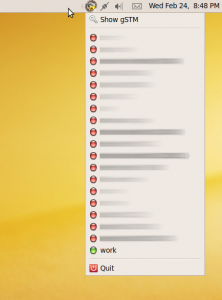
with menu icons

One of the first applications I like to install on a fresh build of ubuntu is called gSTM or “Gnome SSH Tunnel Manager”. This allows me to setup and enable multiple ssh tunnels to/from different places with the click of a button. It provides a nice notification area icon which I can click and see at a glance all the tunnels I have preconfigured. In this same dialog box it shows the connection status of each tunnel indicated by a red(off) green(on) or yellow(?) icon to the left on the tunnel name.

Since Ubuntu 9.10, these status indicator icons are broken by default and need to be turned on by enabling “show menu icons” in the interfaces tab in the appearance preferences. Now with Ubuntu 10.04, this option has been removed from the preferences completely breaking the icons with little to no recourse(yes we can use gconf, I shouldn’t have to!).

Upon discussing (read: complaining) this problem with some of the Gnome community, I have been told that the use of these menu icons in this manner is incorrect and show be done by other means.

I plan to figure out the correct way to show these icons and resume functionality to this application and try to document my journey on here.

  • Step #1 Try to contact original developer: – fail. The contact the developer link on sourceforge gave me a bounceback email.
  • Step #3 Download the source code. – I originally downloaded the tarball from sourceforge. The problem with this is, there’s no debian directory and other magic bits to allow for easy packaging for debian/ubuntu which I would like to do in the end. I then downloaded the source in ubuntu using “sudo apt-get source gstm” which downloads all the source files to /usr/src/gstm1.2 including the packaging bits. And then I remembered about this whole Opportunistic developers thing and more specifically Ground Control by Martin Owens. I already had this installed so I just searched for “gstm” and downloaded the project and what I THINK is the correct branch to work from (gstm 1.2).

I’ve briefly looked at the icons it uses (green.xpm red.xpm yellow.xpm) and grepped for mentions of them in the code. So far i’ve come up with main.c and fniface.c.

Tonight I might try my hand at using one of the other applications mentioned in Jono’s Opportunistic Developer post called Quickly to see if I can import this project and see how it interacts with this developer environment.

continue on to part 2
ANYTHING BUT THE BUTTONS! redux

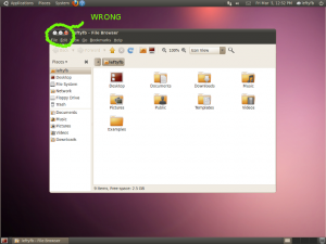
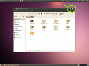
I was going to write up a post complaining about the new version of Ubuntu moving the close, maximize and minimize buttons from the right-hand corner to the left along with instructions for changing it back but Daviey has already done that for me.

I’ve said it before and i’ll say it again; They can set whatever they want as default. Just give the average end user an EASY and intuitive way to change it to their liking.

gconf-editor is not average user friendly and this type of this is most certainly something the average user is going to want to change back. No matter how much the design team wants everyone to “just get used to it”. I’m getting real tired of designers telling me how I should use my computer.

Other than this major problem, I think the new theme and colors look great. I never disliked the orange and brown theme, but a lot of people did. This should make the OS more appealing to a larger audience.